
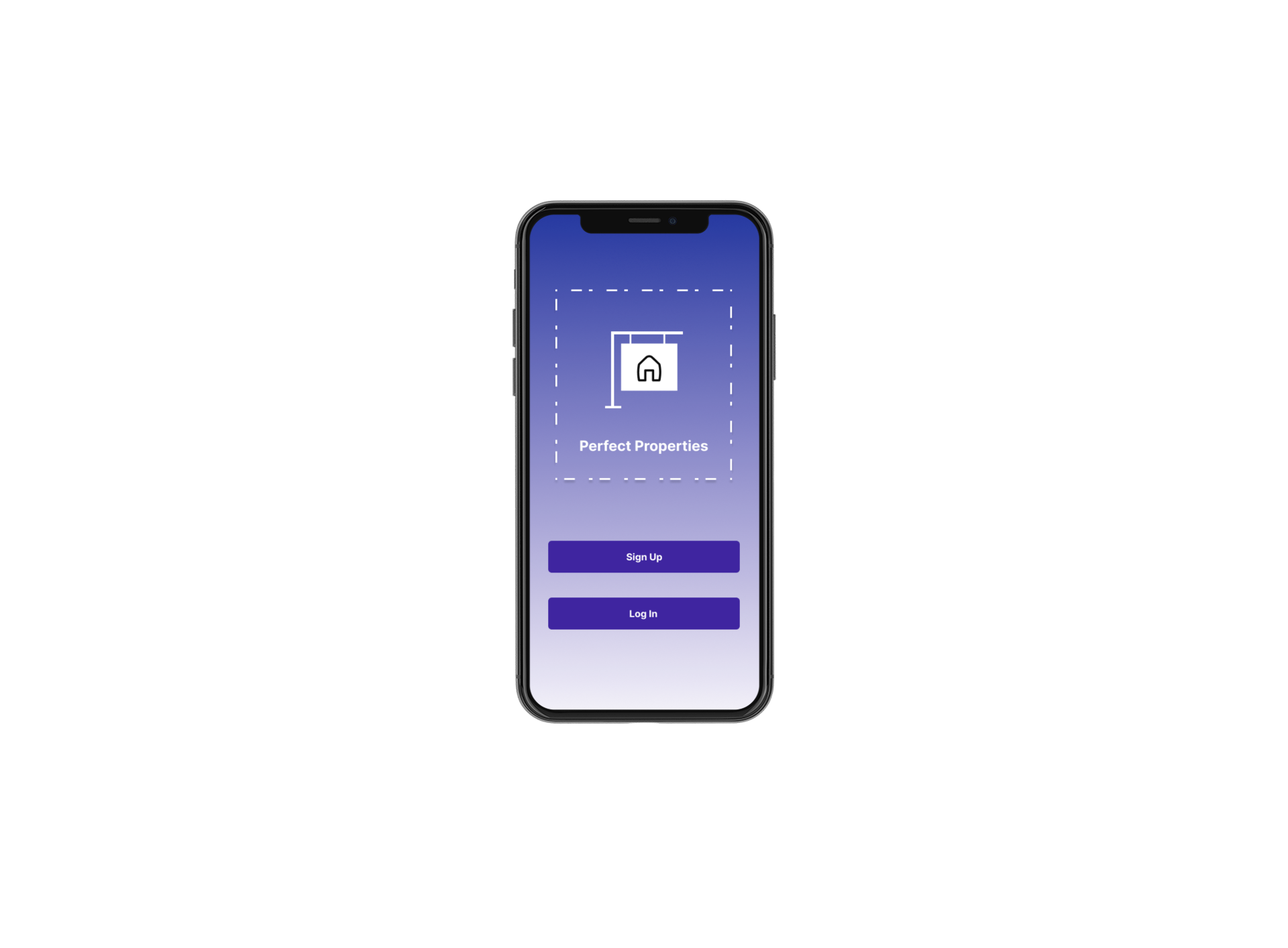
PERFECT PROPERTIES
Perfect Properties is an app that lets you find the property that is perfect for you.

Real estate investment is an increasingly popular way for individuals to achieve financial security. It is an exciting and emotional experience but often complicated. While plenty of blogs and agencies provide information, buyers new to the market may struggle to get started without professional guidance. The “Perfect Properties” web app will provide them with the expertise needed to get started efficiently
Problem
Goal
Design the UI for a responsive web app that would address the following criteria:
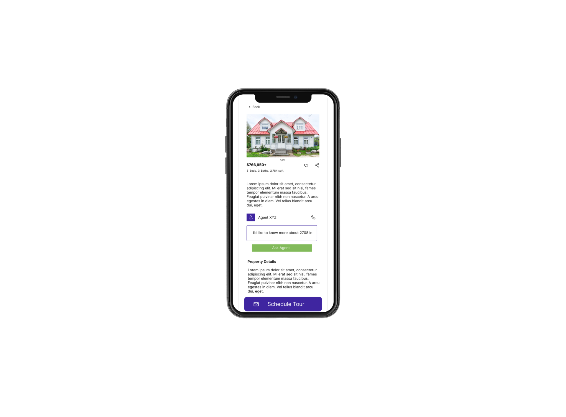
User-friendly database of residential properties with comprehensive info on each listing
The app should provide them with the expertise needed to get started efficiently
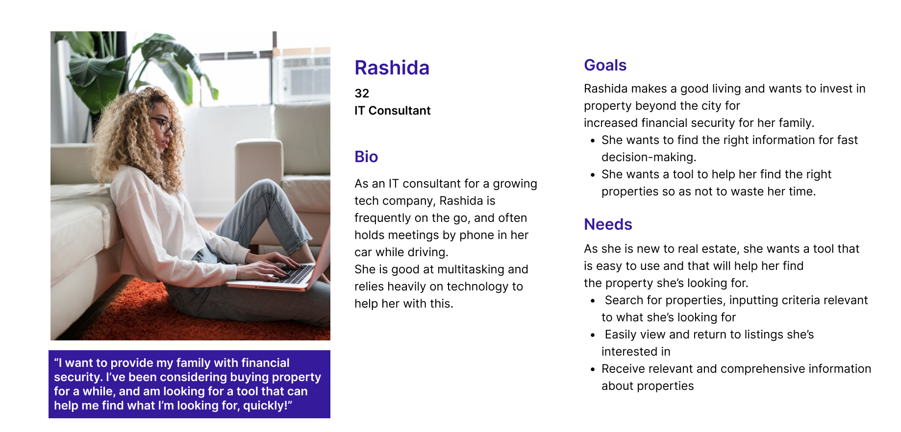
User Persona
Meet Rashida, who is a first-time house buyer looking for a home for her family. She needs a tool to help her find properties in her budget without wasting her time. Rashida and her needs as a user were my starting block for designing “Perfect Properties”.
User Stories and User Flows
Now that I understood Rashida and her needs as a “Perfect Properties” user, I started sketching out user flows based on user stories that were provided in the project brief.

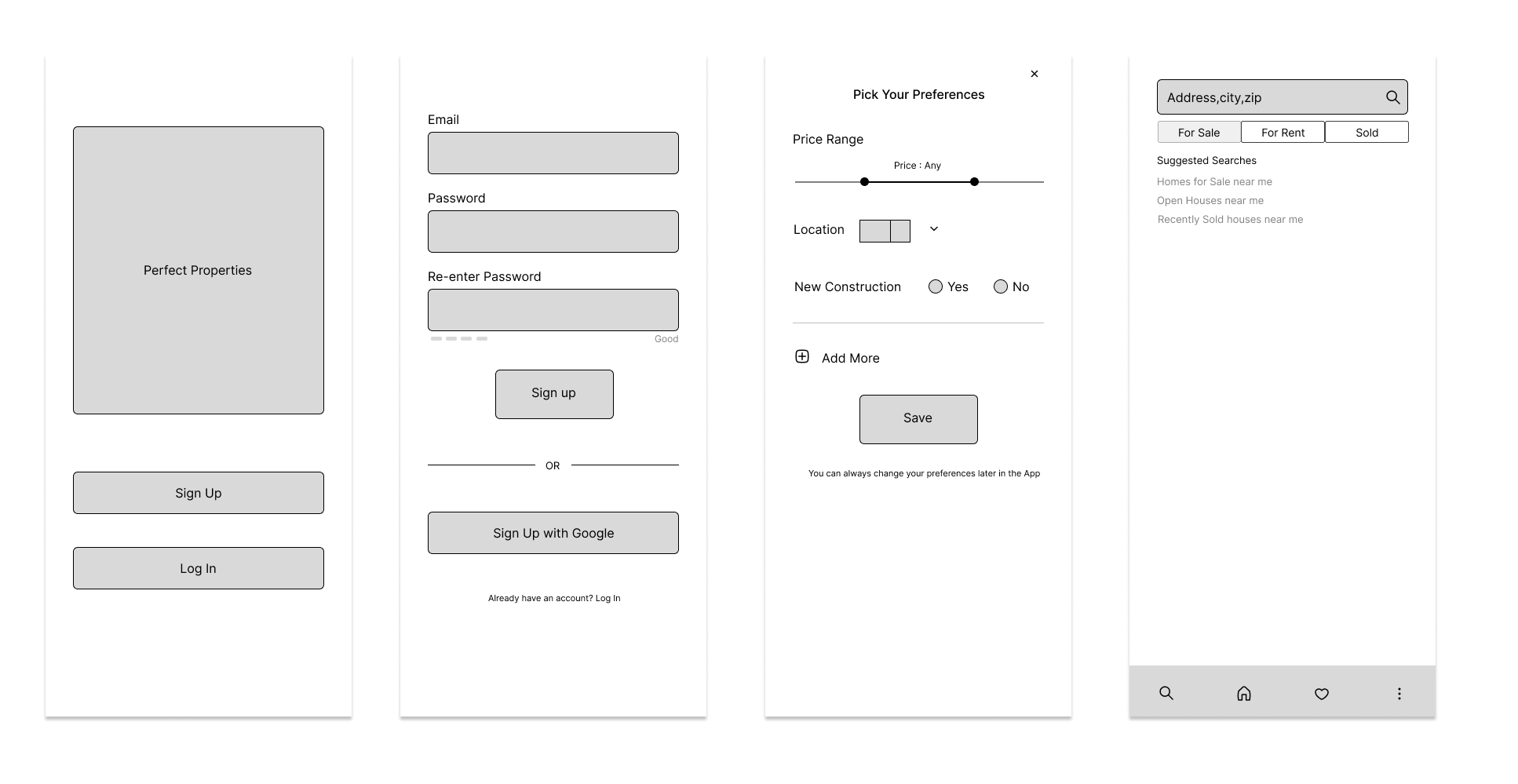
Mid-Fidelity Wireframes
After establishing the information architecture of “Perfect Properties,” I began sketching out low-fidelity wireframes. While sketching, I referenced the user flows I had drawn and started with the most important screens in those flows.
Design

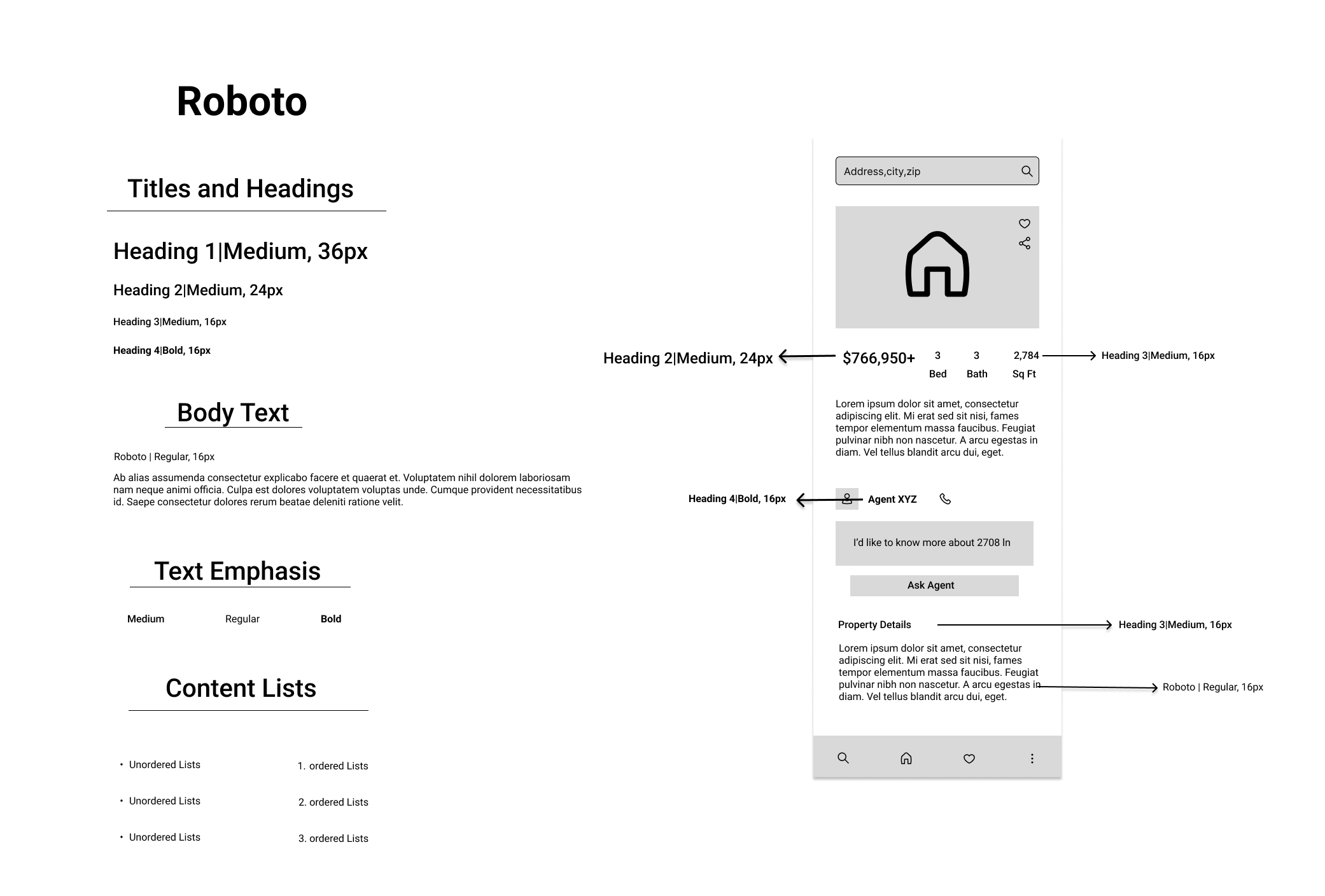
Visual Design
Once our UX was in place, we moved on to the visual aspects of the Perfect Properties app. We began by creating a mood board with inspiring images, colors, words, and fonts. From there we developed a style guide that encompassed the app's visual language.
Mood Board

Typography
Final Design
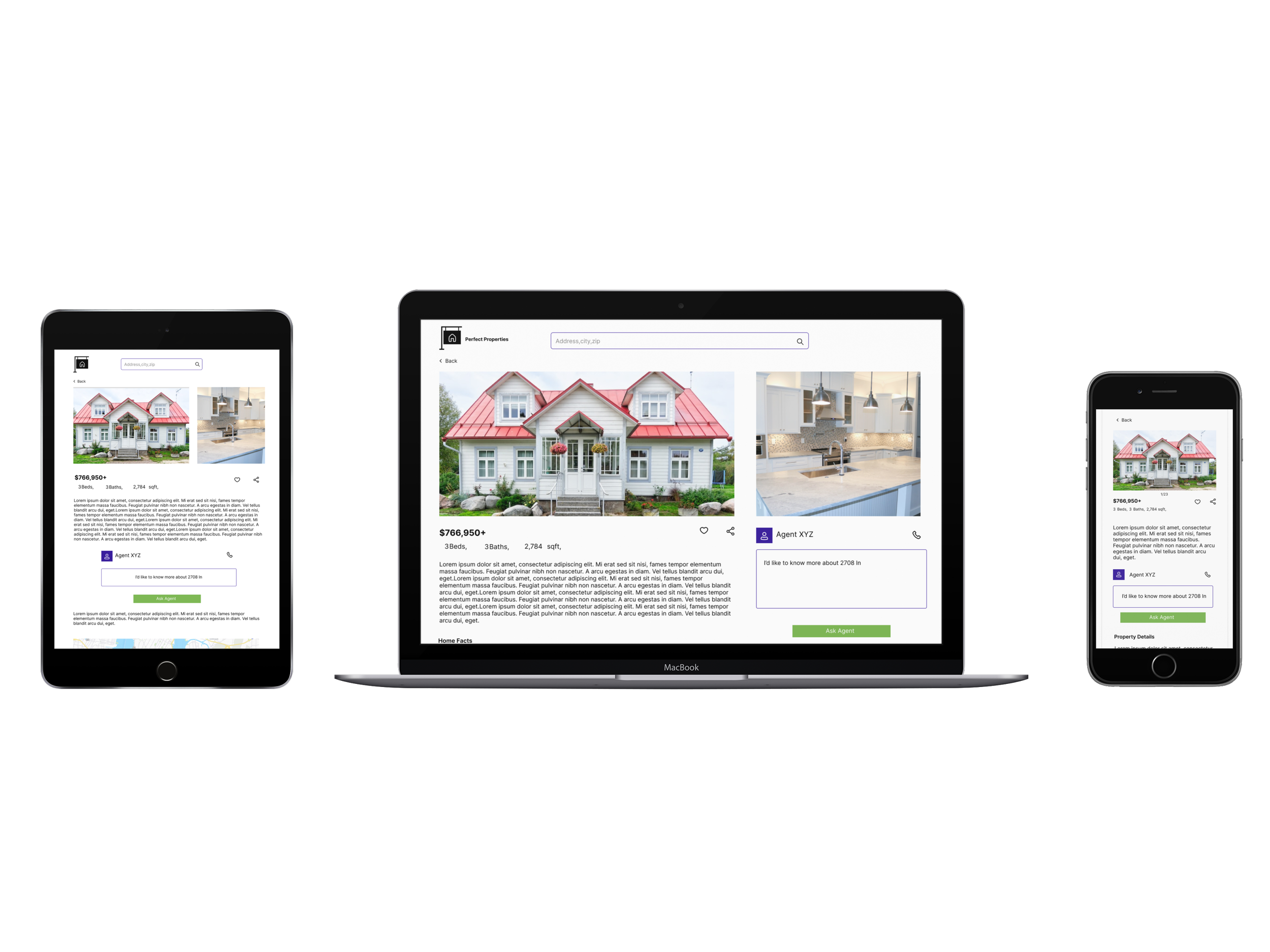
Now that I had mature mobile mockups, the very last step to this project was adapting the design so that “Perfect Properties” looks beautiful on any device.
Breakpoints


Hi-Fidelity Wireframes


Conclusion
“Perfect Properties” is a product of my UI education journey. In particular, one of the most useful concepts that I learned about in this course was designing for various screen sizes and how to pick breakpoints for responsive designs. I dived more into color theory, typography, and learned more about how these visual details can impact a user’s experience. These are learnings that I will take with me to the next project and beyond.